Pop of color 2
Hello!
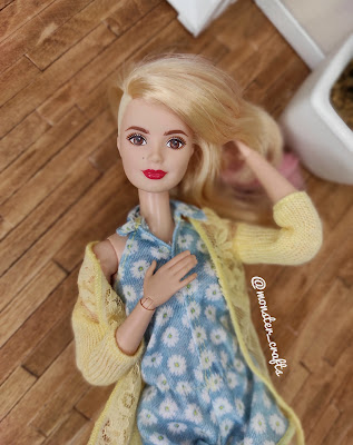
I couldn't write anything because I was busy this week. I'm slowly working in this chair, but I'm working on it. Mr. Monster was painting the house, he couldn't help me with the drawings. In the meantime, I took some pictures of my doll to get something done. If you read my coloring book post, you know that I took some color samples from the shop where I work to use as a backdrop for my doll photo. I paid what I owed and borrowed. I confess that when I am not working, I ask myself: “What color should I wear now?” I can't keep it in my head.
I didn’t plan to write another photo shoot, I wanted to post the teacher, but I’m a little angry because I can’t complete the task and I don’t want to stay away from the blog. For a long time. I like to experiment with photography and color. If you follow me on Instagram , you've probably seen some of the photos, but here we are.
In my last post, I used a dark turquoise color as a background, which I did not pay much attention to. So I started thinking about what it would be like to see Monster High dolls. It really matches the color scheme of the nephra, but doesn't really go out of that background.
Suitable for a vandal, but the hat is too big, so it was hard to imagine.
I chose brown chocolate because I thought it would be nice to look at. It's a neutral color, okay, but I don't like it like other colors. I love how Lin looks against her pink blouse.
There was also a lighter version of turquoise which I chose for my bedroom. It's a beautiful color, but it looks light against the background of the doll.
And with dark tones there is not much difference.
I wanted to go for a bright green, but the green in this color chart is a little annoying. Green bamboo does not flatter dolls.
This seems especially annoying against the backdrop of multi-colored dolls such as Posya. Same base, but looks very different, right?
The red in the previous post is still my favorite. I don't think there is a doll that looks bad.
The dark purple background matches Raven Quinn's color but is not actually visible.
I have darker, darker red, more contrast.
In the previous photo shoot, I took a darker shade of lavender, which is so light on the eyes that it looks even better.
Seems very neutral. I wonder what a dark tone would look like...
I like hot pinks and oranges for my photos, but this is the best I can find. Nice, but not exactly what I'm looking for.
Lately I've been doing stuff like that, taking pictures of dolls. I hope to finish the chair soon and show it off. I am also thinking of getting something new as a precedent in doll photography. I have seen a glitter card which is a lot of fun to use.
What do you use as a background for your photo?
MS


